GÜT
Stomach Strengthening Shots

Art Direction
Copywriting
Packaging Design
Art Direction Copywriting Packaging Design
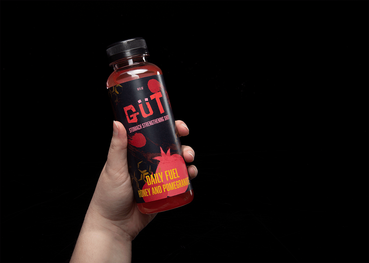
GÜT Revolutionize your digestive health.
CHALLENGE
In the market of digestive health drinks, there’s a serious gap between health and taste. GÜT, rebels against the norm and revolutionizes digestive health with natural ingredients and robust flavors that go down smooth. Health shouldn’t sacrifice flavor: GÜT has it all. How do we design packaging to maximize disruption and mirror our ethos?
APPROACH
GÜT jumps off the shelf with a strong graphic presence and an even stronger selling point: deliciousness. Leveraging a bold visual identity, flavor and a sense of rebellion are brought to the forefront.
INPUT
Conceptualization
Art Direction
Packaging Design
Copywriting
OUTPUT
A visual identity and packaging design system that extends through four SKUs, supported by a dynamic graphics and copywriting that elevates the tone of voice.
ADAPTABILITY
GÜT has a dynamic logo system that adapts to different flavor profiles and SKUs. Simple and clear graphic variation prepares the brand for future expansion and product adaptability.
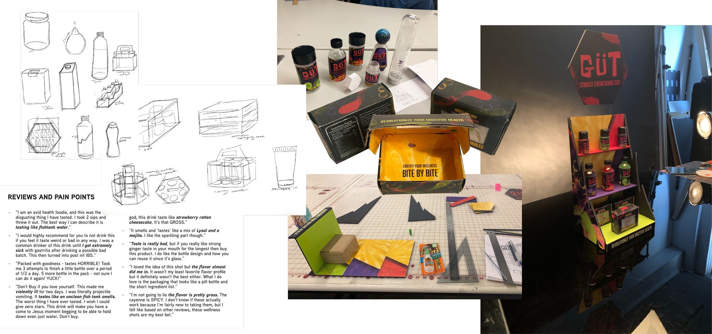
RESEARCH
Identifying pain points and market gaps that can be leveraged in GÜT’s favor. Clarifying product values.
FORM EXPLORATION
Model making, form testing, and getting a hand-feel for how the packaging will work across SKUs.
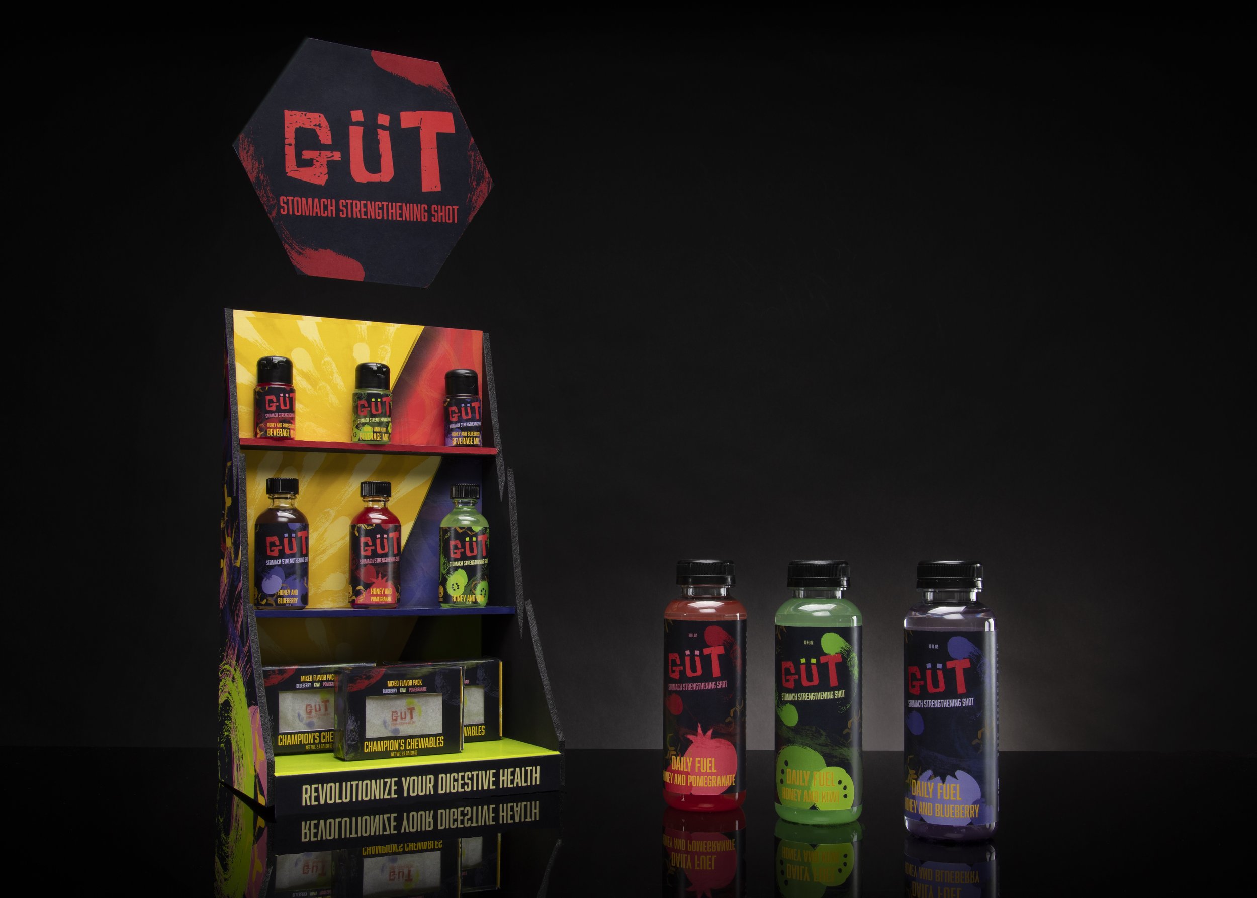
PRODUCT SHOTS
Creating a branded POP display shelf that stores the smaller SKUs. I worked with a photographer to stage product shots.
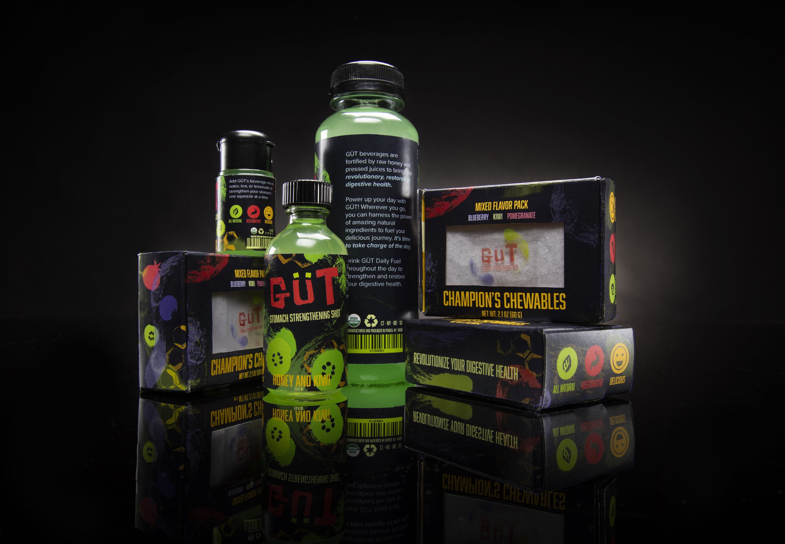
EXPLODING WITH FLAVOR
Every GÜT product is packed full of flavor derived from ingredients that heal the digestive system.